Core Principles of Technical Analysis
Technical analysis is based on the idea that price charts contain all the information a trader needs. This approach depends on three core beliefs about how markets behave and how traders can read price movements to make decisions.
Market Psychology and Price Movements
Price charts show how traders feel about an asset at any moment. When Bitcoin jumps from $40,000 to $45,000 in a day, that move reflects thousands of traders buying and selling.
Emotions like fear and greed drive price changes in ways that create repeating patterns. For example, a trader might buy more Ethereum as it climbs, while another might sell during a sharp drop. These reactions form patterns that show up again and again.
The chart becomes a visual record of the battle between buyers and sellers. A long green candle means buyers won that session. A series of lower lows shows sellers are in control. For crypto traders, this matters because digital assets often react to sentiment instead of company fundamentals.
Key Assumptions for Valid Analysis
Three main assumptions support technical analysis. First, the market discounts everything—current prices reflect all available information. For crypto, this includes news, regulations, technology updates, and market mood.
Second, prices move in trends. An uptrend means higher highs and higher lows, while a downtrend is the opposite. Sideways movement means the market is undecided. Traders look for these trends to decide which way an asset is heading.
Third, history repeats itself. Chart patterns seen in stocks decades ago also appear in crypto markets today. Patterns like head and shoulders or double bottoms work because human psychology stays the same across assets and timeframes.
Limitations and Common Pitfalls
Technical analysis is not perfect. False signals are common, especially in volatile crypto markets where trends can reverse quickly. Relying on a single indicator can lead to mistakes.
Another issue is the self-fulfilling prophecy. If enough traders believe a support level exists at $30,000 for Bitcoin, they will buy there, making the level hold simply because everyone expects it to.
Common mistakes include:
- Ignoring volume data when analyzing price movements
- Using too many indicators that contradict each other
- Failing to set stop-loss orders based on technical levels
- Letting emotions override what the chart shows
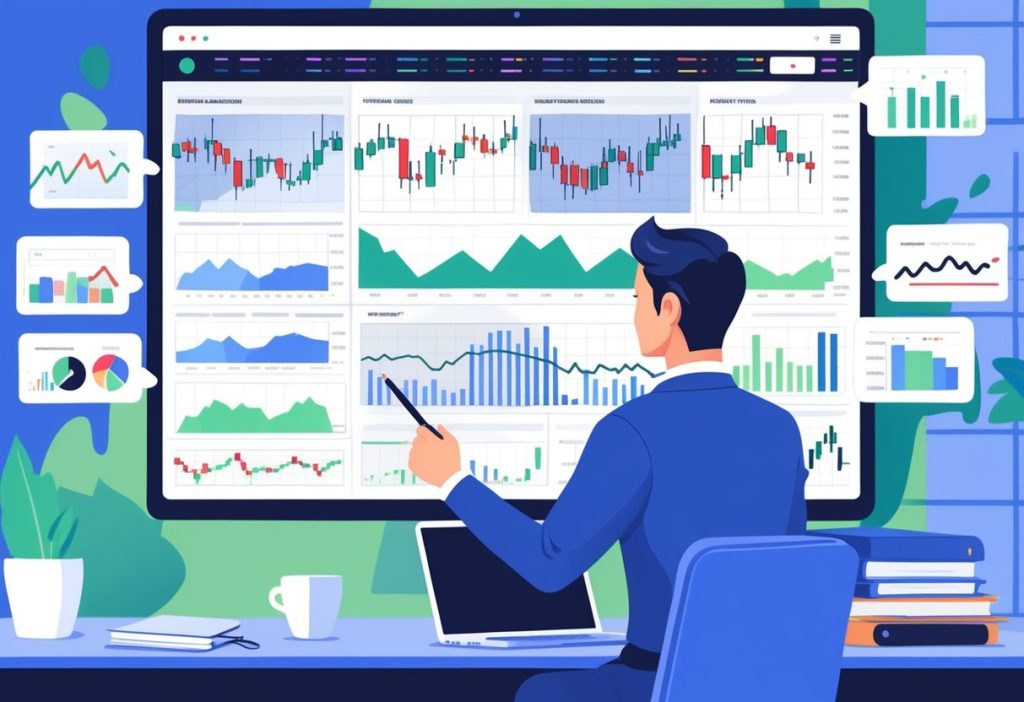
Essential Chart Types and Patterns
Traders use three main chart types to analyze price movements and spot opportunities. Line charts show basic trends, bar charts reveal detailed price action, and candlestick patterns help identify trading signals.
Line Charts: Trend Spotting
Line charts connect closing prices over time with a single line. They show the overall direction of an asset without extra details.
These charts are good for quickly seeing if Bitcoin or Ethereum is trending up, down, or sideways. The line rises when buyers are in control and falls when sellers take over.
Support levels appear where the line bounces upward several times. Resistance shows where the line hits a ceiling and falls back. Breaking these levels often signals a shift in direction.
Line charts do not show the high, low, or opening prices for each period. For beginners, they offer a simple way to start reading crypto markets before moving to more complex charts.
Bar Charts: Reading Market Data
Bar charts display four price points for each period using vertical lines with small horizontal ticks. The top of the bar is the highest price, and the bottom is the lowest.
The left tick shows the opening price, and the right tick shows the closing price. A right tick higher than the left means buyers pushed prices up during that time.
Tall bars show high volatility and large price swings. Short bars mean prices barely moved. Traders use bar charts on 4-hour to daily timeframes to see how buyers or sellers acted during specific sessions.
Candlestick Patterns: Crypto Examples
Candlestick charts use colored rectangles and wicks to show the same four price points as bar charts but in a more visual way. A green or white candle means closing price was higher than opening. Red or black candles show the opposite.
The body spans from open to close. Wicks show the high and low prices. Long wicks mean prices were pushed back quickly at those levels.
Common patterns help traders predict reversals. The hammer appears after a downtrend with a small body at the top and a long lower wick, showing buyers fought back. The doji has a tiny body where open and close nearly match, signaling indecision before a possible trend change.
The bullish engulfing pattern forms when a large green candle covers the previous red candle, signaling strong buying pressure. These patterns often appear before major Bitcoin rallies.
Reliable candlestick patterns need confirmation through higher volume or breaks above resistance. Spotting a pattern alone does not guarantee the move will follow.
Key Technical Indicators and Tools
Technical indicators turn price data into trading signals by measuring momentum, trend strength, and market participation. Moving averages help traders time their trades, while RSI and MACD show if markets are overbought or oversold, and volume analysis confirms the strength behind price moves.
Moving Averages for Entry and Exit
Moving averages smooth out price swings to show the trend direction. The simple moving average (SMA) averages prices over a period, while the exponential moving average (EMA) gives more weight to recent prices for quicker signals.
Traders often use two moving averages together. When a short average crosses above a longer one, it signals a possible buy. A cross below suggests a sell. The 50-day and 200-day averages are common for longer trends. Day traders might use 9-day and 21-day averages for faster signals.
Price trading above a moving average suggests bullish momentum, while below means bearish pressure. Many traders wait for price to pull back to a moving average during an uptrend before entering, using it as support. In downtrends, the moving average acts as resistance.
RSI and MACD Explained
The Relative Strength Index (RSI) measures momentum from 0 to 100. Above 70 means overbought, and price may fall. Below 30 means oversold, and price could rise. Traders often wait for RSI to cross back below 70 or above 30 before acting.
The Moving Average Convergence Divergence (MACD) tracks trend direction and momentum with two lines. When the MACD line crosses above the signal line, it gives a bullish signal. A cross below is bearish. The histogram shows the difference between the lines and momentum strength.
RSI is best for spotting reversals, while MACD confirms trend changes. Using both together provides stronger signals. For example, if RSI shows oversold and MACD turns bullish, the setup is more reliable.
Divergence between price and these indicators often signals a reversal. If price makes new highs but RSI or MACD makes lower highs, the trend may be weakening.
Volume Analysis Techniques
Volume measures how many units of an asset trade in a period. Rising volume during price increases confirms buyer strength. Rising volume during declines shows strong selling.
On-balance volume (OBV) adds volume on up days and subtracts on down days to create a running total. If OBV rises while price moves sideways, it suggests big traders are buying before a breakout. The opposite means selling before a drop.
Volume should rise in the same direction as the trend. An uptrend with falling volume is weak and may not last. Breakouts need volume confirmation—without it, they often fail.
Sharp volume spikes can mark turning points. Extreme volume at bottoms can signal the last sellers are out before a reversal. At tops, volume spikes may mean big players are selling.
Technical Analysis Strategies for Crypto Casino Markets
Technical analysis tools for crypto trading can help casino players decide when to deposit, withdraw, or adjust their bankroll. These strategies focus on tracking price movements and timing transactions for better value.
Applying Technical Analysis to Crypto Trading
Crypto technical analysis uses price charts and patterns to predict where assets like Bitcoin or Ethereum might move next. Traders watch support levels (where prices stop falling) and resistance levels (where prices struggle to rise).
Patterns like head and shoulders, triangles, and double tops can signal price reversals. Indicators such as RSI show if a crypto asset is overbought or oversold. MACD shows momentum shifts.
Players can use these tools to time crypto purchases. Buying during a dip at support levels means getting more coins for the same amount. This gives better value when depositing to a casino account.
Volume analysis confirms price moves. High volume during an uptrend shows strong buying. Low volume during price rises may signal a weak rally that could reverse.
Strategy Adaptation for Crypto Casino Players
Casino players use technical analysis differently than traders. The goal is bankroll optimization and good transaction timing.
Key adaptations include:
- Monitoring 24-hour price windows before deposits
- Setting alerts for support levels to buy at lower prices
- Tracking withdrawal timing to avoid high-volatility periods
- Using stablecoins during uncertain market conditions
Players who watch charts can deposit when crypto prices dip 5-10% below recent averages, stretching their bankroll further. For example, depositing $100 during a Bitcoin dip at $95,000 instead of $100,000 gives about 5% more playing power.
Withdrawal timing matters too. Cashing out when prices spike above resistance turns winnings into more fiat. Technical indicators help identify these exit points without constant monitoring.
Risk Management and Safe Play
Technical analysis cannot predict the future. Crypto markets are unpredictable and run 24/7 with no breaks.
Set clear limits before using any strategy. Decide deposit amounts based on what you can afford, not just technical signals. Never deposit more in hopes of a price recovery.
Essential risk controls:
| Practice | Purpose |
| Stop-loss mentality | Exit positions at predetermined price drops |
| Position sizing | Limit single deposits to 5-10% of total bankroll |
| Diversification | Use multiple cryptocurrencies to spread risk |
| Time limits | Avoid emotional decisions during rapid price swings |
Casino play has its own risks apart from crypto volatility. Technical analysis helps with transaction timing, not gambling outcomes. Keep separate budgets for crypto holdings and casino play.
Cold storage protects long-term crypto holdings. Keep only active playing funds in hot wallets or exchanges. This helps prevent impulsive decisions during losing streaks or market drops.
Frequently Asked Questions
What are the core principles behind candlestick charting, and how can they inform your trading decisions?
Candlestick charts display four main price points for any time period: opening, closing, highest, and lowest prices. Each candlestick uses a body and wicks to show this information visually. The body shows the range between open and close, while the wicks extend to the high and low points reached during that period.
The candlestick color tells traders if price moved up or down. A green or white body means the closing price was higher than the opening price. A red or black body shows price closed lower than it opened.
Patterns form when several candlesticks appear in certain sequences. A bullish engulfing pattern happens when a large green candle covers the previous red candle, suggesting buyers are in control. Three black crows show three red candles with lower closes, warning that sellers dominate the market.
Traders use these patterns to find possible entry and exit points. The patterns work because they reflect real buying and selling pressure. When combined with other analysis tools, candlestick patterns help traders decide when to enter or exit positions.
How do moving averages simplify market trends, and why should you include them in your analysis toolkit?
Moving averages smooth price data by creating an updated average price over a set period. A 50-day moving average calculates the average closing price of the last 50 days and updates each day as new data comes in. This creates a single line on the chart that filters out short-term price swings.
Simple moving averages (SMA) give equal weight to all prices in the period. Exponential moving averages (EMA) give more weight to recent prices, making them react faster to new price changes. Both types help traders spot the direction of the current trend without getting distracted by daily moves.
Traders often use moving average crossovers as signals. A golden cross happens when a short-term moving average crosses above a long-term one, suggesting bullish momentum. A death cross is the opposite, with the short-term average crossing below the long-term average.
The slope of a moving average shows trend strength. A steep upward slope indicates strong buying, while a flat moving average suggests the market lacks direction. Traders can use moving averages to time their positions, entering when trends match their analysis and staying out during uncertain periods.
In what ways can support and resistance levels help you better understand market psychology and asset valuation?
Support levels are price points where buying pressure often prevents further declines. Traders remember these levels and place buy orders near them, creating a cycle where demand increases as price approaches support.
Resistance levels mark prices where selling pressure has stopped upward moves before. Sellers appear at these levels because they see the asset as overvalued or want to take profits.
These levels reflect the collective memory and psychology of market participants. For example, if a crypto asset bounces off $30,000 several times, strong support forms at that level. Breaking through a well-established level signals a change in market sentiment and can lead to strong price movements.
The strength of support and resistance depends on how often they are tested. Levels tested many times are more important than those touched only once. Higher trading volumes at certain prices create stronger levels. Traders use these levels to set entry points, exit targets, and stop-loss orders that align with natural market boundaries.
What role do volume indicators play in confirming the strength of a market trend?
Volume measures how much of an asset changes hands during a set time. High volume shows strong trader participation, while low volume means limited interest. Volume helps traders see if price moves are meaningful or just random noise.
On-Balance Volume (OBV) adds volume on up days and subtracts it on down days. When OBV rises with price, it confirms that buying pressure supports the uptrend. If price rises but OBV falls, it warns the rally may lack strength and could reverse.
The Money Flow Index (MFI) combines price and volume to show buying and selling pressure. It ranges from 0 to 100, with readings above 80 suggesting the asset might be overbought and below 20 indicating oversold conditions. MFI considers whether volume flows in during price increases or decreases.
Volume spikes often happen at trend reversals or breakouts. A breakout above resistance with high volume suggests strong interest and a higher chance that the move will continue. A breakout on low volume might be a false signal. Checking volume before trading helps you avoid weak setups and focus on better opportunities.
How can momentum indicators assist you in identifying the potential for trend reversals or continuations?
Momentum indicators measure the speed and strength of price movements. They help traders spot when trends might be losing steam or gaining new energy. These tools work by comparing current prices to past prices over specific time periods.
The Relative Strength Index (RSI) oscillates between 0 and 100, showing whether an asset is overbought or oversold. Readings above 70 suggest the asset has risen too fast and might pull back. Readings below 30 indicate heavy selling that could lead to a bounce. RSI also shows divergences when it moves opposite to price, warning of potential reversals.
The Stochastic Oscillator compares the current closing price to the price range over a set period. It generates buy signals when it crosses above 20 from below and sell signals when it crosses below 80 from above. Fast stochastics react quickly to price changes, while slow stochastics smooth the data to reduce false signals.
Moving Average Convergence Divergence (MACD) uses two exponential moving averages to show momentum shifts. When the MACD line crosses above the signal line, it suggests bullish momentum. Crosses below the signal line indicate bearish momentum. The histogram shows the distance between these lines, revealing whether momentum is strengthening or weakening.